Redefining a heritage institution.
St John’s is a historic independent college within Durham University. The team asked Kit to help establish and reinforce their independent identity by redefining their brand. It needed to be a brand designed to last. To be stewarded. And to grow more meaningful with time.
Education as a human craft
St John’s is a place where education is treated as a valued craft. Shaped by effort and responsibility. At a time when remote learning and AI have made students question the value of formal education, human craft has never mattered so much.
At St John’s there’s a sense of pride in belonging to something that feels considered, human, and worth the investment. It’s a college that believes learning is not frictionless, and that the effort involved is precisely where its value lies.
For us, this project had to be more than a rebrand. It needed to be a design system that reflected why education matters. And stand the test of time.
Embracing complexity
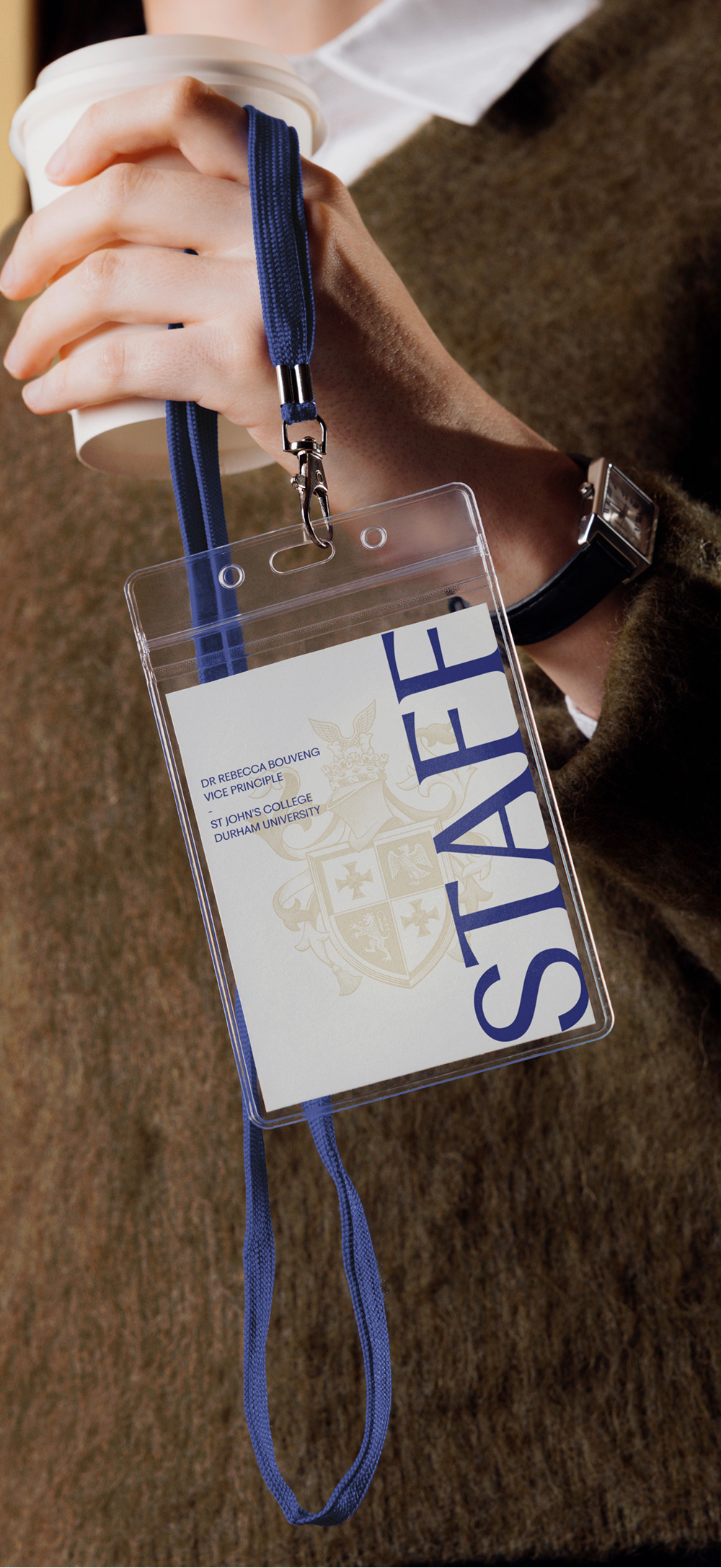
Now we’re seeing a shift towards things that feel more textured. More human. For us, St John’s shield was an opportunity to embody craft, community and complexity.
Design has spent decades seeking ease, speed, and seamlessness. The prevailing logic has been: The faster something is to understand, the better. The easier it is to navigate, the more successful. The less effort required, the more ‘modern’ it feels.
But frictionless design has a cost – things don’t necessarily feel better. Instead, much of the world now feels flat, interchangeable and strangely unconvincing.

Redrawing the coat of arms
Since 1909, St John’s has seen many versions of its identity. Each shaped by the needs of its time. The clearest example is the shield.
We worked with a illustrator; Nathan Yoder, who understood the value of human judgement and detail. The shield was redrawn line by line. This process was a deliberate rejection of disposable digital logic, and a reasserting of care, labour and authorship.
A modern serif with flared details balances clarity with character.

Typography
We worked closely with typographer Leo Field to refine the type. The choice is contemporary without smoothing away St John’s history. It’s evidence that the college takes responsibility for what it passes on.
An enduring identity, shaped by purpose

For a brand that would outlive those that created it, it was important that we drew from the college – its architecture, history, materials and sense of community. The blues, reds, golds, and sandstone of the palette came directly from the physical building. Every detail was considered, not automated, from monograms to icons.
Each design decision reflects the value behind effort and embodies St John’s principles: education as formation, not merely instruction; community is integral to scholarship; faith invites dialogue; and what is worth doing is worth doing with care.
The result is a design system that’s built to flex whatever comes, that celebrates effort and craft and is rooted in place, community and history.


Illustration
Inspired by the stained glass windows around the buildings. We have created a set of line drawings to compliment the brand identity. Used sparingly these can sit on their own or with typography to add a visual element.

Website
The St John’s website was reimagined to better reflect the college’s character.
As the primary point of information, clarity was key. We focused on structure, hierarchy and navigation making information easier to find while creating space for the stories, people and culture of St John’s to surface naturally.


A refined digital language brought consistency across the experience, balancing the college’s heritage with a more contemporary sense of confidence and usability.