Rebranding crypto complexity into financial services clarity
From traditional crypto aesthetic to assured financial services identity – a rebrand and new website for MidChains, a UAE digital asset trading company.
ALIGNING AN IDENTITY
MidChains is a platform that enables the regulated movement of money between traditional currencies and cryptocurrencies (more broadly known as digital assets). The team asked Kit to create a composed identity, in line with what the company stands for – stringent regulation, sovereign backing and pedigree. In response, we built a brand that avoided traditional crypto cues and felt at home in an investor’s world – reflecting the calibre of MidChains’ clients.
DESIGNING THE INTANGIBLE
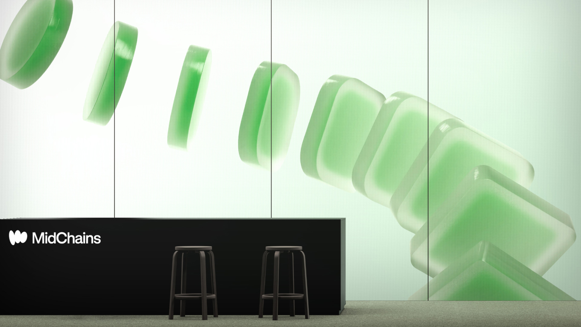
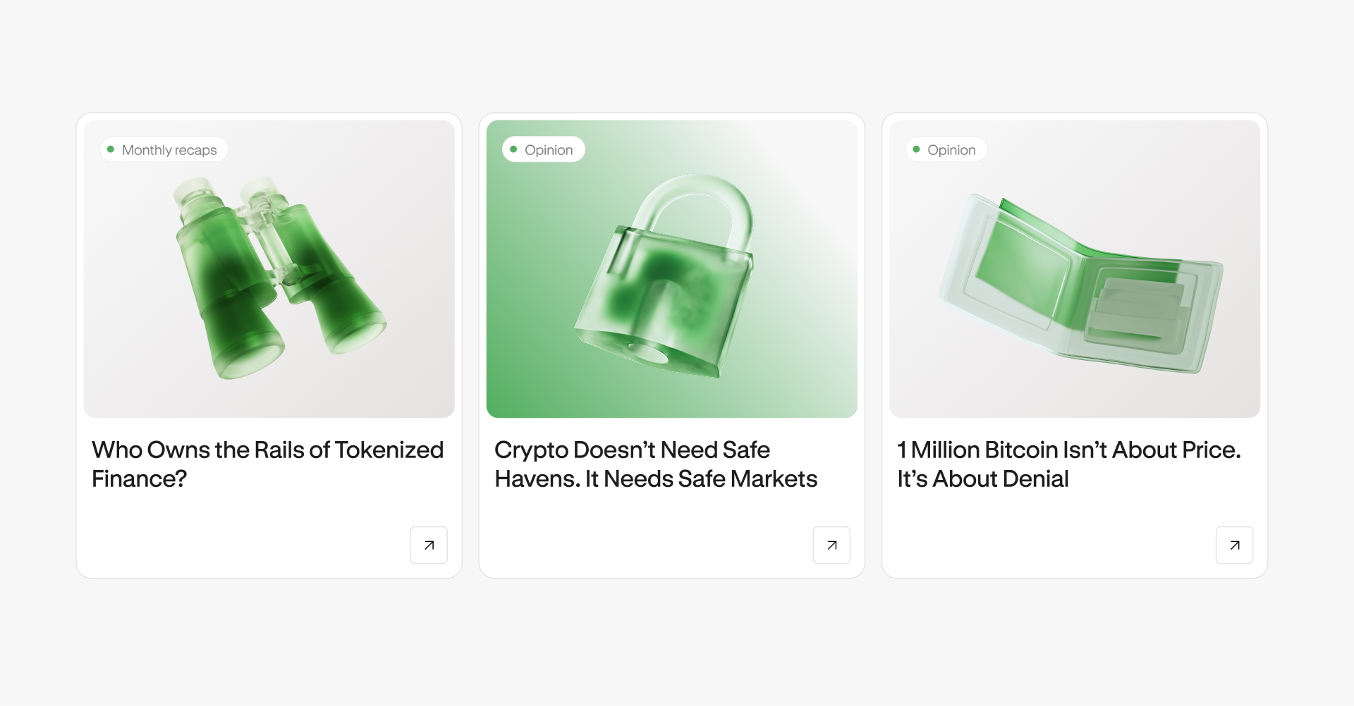
Many customers don’t want or need to understand the infrastructure behind trading. They simply need to know the service is credible and frictionless.The idea of a flowing coin became central to the identity, inspiring the logo mark, an abstract ‘m’ made up of three coins. A 3D artist created the hero motion visual, developing 3D coins with a frosted glass render. They move fluidly with the cursor to simulate the ease of money movement. The ovoid shape informs the wider design kit too, from 50 custom icons with a curved style, to isometric illustrations that add tangibility to explainer sections.

AN EFFORTLESS DIGITAL EXPERIENCE
The new website elevates MidChains UX from start-up feel to enterprise-level business. A mega nav makes services easier to tell apart and explore, while the minimal UI keeps the experience clear and sophisticated. Showing the people behind MidChains was a priority in building trust – few direct competitors do it. Clean, upfront imagery and quotes from both the founders and their backers put faces and voices to the business.


SIGNALLING SECURITY, STYLE & SUBSTANCE
Green is distinctive in a financial landscape where blue is common. It is strongly tied to wealth and security, as well as action and permission. The typography is a simple sans serif, GT Standard, set in black, white and greys for a clear, understated feel.

The tone of voice reinforces this, using modern banking language to communicate calibre and set MidChains apart from other platforms with a touch of panache. The assertive hero headline ‘Money Talks. We Make it Move’ distinguishes MidChains from passive trading platforms, positioning the company as an experienced financial partner.